#101549Improve pagination of tables inside list module.
Riccardo De Contardi 08/03/23, 13:40 updated 10/19/26, 07:27

Description
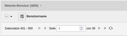
When you have more that 50 records on a table inside the list module, a pagination can be shown , which is currently like this one:
This has the following flaws
- there is a “reload” icon whose purpose is unclear: the user can mistake it for a “Go to” button by entering a page number and press it.
The actual purpose of the button is to reload the list in case the data shown are not up-to-date with the actual data. - Also some users don’t know that they have to press enter to reach the page.
- the input field works by steps but the arrows are really small
My proposal
- add a label “Refresh” next to the reload icon
- de-emphasize it or put it apart to avoid confusion
- add an explicit “go to” button
- use a plain input field (only numbers) to enter a page number – the up/down arrows should be removed as they’re too small
Here is a mockup:
Reviews 0
No change resolves or names this issue in its commit message, and no comment links one.
Fix this issue
Start the commit message of your patch with this. Add what the patch does, and the versions it goes to in "Releases:". How to create a patch
- Commit message
-
[FEATURE] Improve pagination of tables inside list module.

Resolves: #101549
Releases: main
Related issues 1

Files 4



History 6
-
Riccardo De Contardi changed Related to #101540 <span data-processor="relativetime" data-value="2023-08-03T13:41:06+00:00" > 08/03/23, 13:41 </span>
-
Benni Mack changed target version <span data-processor="relativetime" data-value="2024-10-15T09:46:17+00:00" > 10/15/24, 09:46 </span>
-
Benni Mack commented and changed status
NewNeeds Feedback <span data-processor="relativetime" data-value="2025-03-23T18:57:45+00:00" > 03/23/25, 18:57 </span> -
Riccardo De Contardi commented and changed attached screenshot_2025-03-24_at_16.28.21.png <span data-processor="relativetime" data-value="2025-03-24T17:06:39+00:00" > 03/24/25, 17:06 </span>
Thanks to Benni Mack I’m able to add here the screenshot valid for the latest version:
screenshot_2025-03-24_at_16.28.21.png
Apart from the appearance of the buttons, I’d say that this widget is pretty much identical to my initial screenshot.
I’m not sure about it, but I think that the input field for the page number has always been an
<input type="number">thus my point about the ‘arrows’ would be unnecessary -
Georg Ringer commented and changed attached Bildschirmfoto 2026-10-18 um 16.05.01.png <span data-processor="relativetime" data-value="2026-10-18T14:05:42+00:00" > 10/18/26, 14:05 </span>
what about removing the reload icon as the reload is in the toolbar as well?
Bildschirmfoto%202026-10-18%20um%2016.05.01.png
-
Riccardo De Contardi commented <span data-processor="relativetime" data-value="2026-10-19T07:27:07+00:00" > 10/19/26, 07:27 </span>
Hi Georg. I’m not sure… there are three things that hold me back on accepting this solution:
1. The two buttons do the same job? I mean, does the button on the pagination reload just that table or the whole page (like the one on the top right corner)? I’m asking you, I don’t know.
2. a good UX habit is to put the control (button, icon, dropdown, etc.) where it effects change So having a button so distant respect to the object it manipulates is almost always not a good idea.
I’d still keep it and as I suggested, add a label like “reload table” or “reload list” or similar
3. This still does not address the other problem: I still advocate for an explicit “Go button” near the input field: right now if you want to go to page 10 or 22 or whatever you have to put that number in the input and press enter to submit the request.
Of course I am open to the opinions of others. Cheers.


Hey,
I think we’ve gotten much better in the latest v13 release. Can you update the issue description for the 2025 changes? :)